Simpson's Paradox: When the Aggregate Lies
Table of contents
You shipped the redesign and the overall signup rate dropped two points. The old flow converted at eleven percent, the new one at nine, and the obvious move was to roll it back before it cost another week. Then someone broke the numbers down by traffic source, and the picture inverted. Among visitors from search, the new flow won. Among visitors from paid ads, the new flow won. Among visitors from the newsletter, the new flow won. Every single source converted better on the new design, and yet the combined number was worse. Nobody had faked anything. The aggregate and the segments were both computed correctly, from the same rows, and they said opposite things.
That is not a bug in the data or a rounding error. It is a named statistical phenomenon, and once you have seen it you start seeing it everywhere a number gets summarized. The thing that makes it dangerous is not that it is rare, it is that the pooled number looks authoritative and complete while quietly pointing the wrong way. A team that trusts the headline figure and never looks underneath it will confidently make the worse decision, roll back the better design, kill the better campaign, and never know it got played by its own arithmetic.
What is Simpson's paradox?
Simpson's paradox is a statistical phenomenon where a trend or relationship that holds within every subgroup of the data disappears or reverses when those subgroups are combined into a single pooled total. Each group tells one story; the aggregate tells the opposite one. It is named after Edward Simpson, who described it formally in 1951, though Karl Pearson and Udny Yule had noted the effect decades earlier, which is why it is sometimes called the Yule-Simpson effect.
The reversal is not magic. It comes from two things acting together: a confounding variable (a hidden third factor that is correlated with both the thing you are measuring and the groups) and unequal group sizes that let one group's weight dominate the pooled total. In the redesign example, the lurking variable was traffic source. Paid-ad visitors convert far worse than newsletter visitors no matter what the page looks like, and the new design happened to be shown to a larger share of paid-ad traffic during the test. When you pool everyone together, that unfavorable mix drags the new design's combined number below the old one, even though the new design beat the old one inside every source. The segments measure the design. The aggregate measures the design tangled up with the traffic mix, and the mix wins.
The practical lesson arrives fast: a single summary statistic is a lossy compression of the data underneath it, and the thing it most often loses is the one split that would have reversed your conclusion. Try Scribelet free if you want a place to keep the splits and caveats behind your numbers, because the paradox is really a failure to write down which groups a metric was pooling over.
The example everyone reaches for: Berkeley admissions
The textbook case is the 1973 University of California, Berkeley graduate admissions data. Looking at the whole university, men were admitted at a noticeably higher rate than women, which looked like clear bias against female applicants. Broken down by department, the effect reversed or vanished: in most departments women were admitted at a slightly higher rate than men. The confounder was which departments people applied to. Women applied in larger numbers to competitive departments with low admission rates, while men applied more to departments that admitted almost everyone, so the pooled rate made the university look biased against women when no individual department was.
It is a clean illustration and worth knowing, but the Berkeley case is where most explanations stop, and stopping there is a mistake. You are not going to be handed a famous dataset with the paradox pre-labeled. You are going to meet it unlabeled, inside your own dashboard, on a Tuesday, disguised as a number that simply looks a little off. The useful skill is not reciting Berkeley. It is recognizing the shape of the reversal in data nobody has flagged for you yet.
Why the reversal happens
The mechanism is easier to see than to say. Picture each group as its own little cloud of points with its own trend, and then imagine where those clouds sit relative to each other.
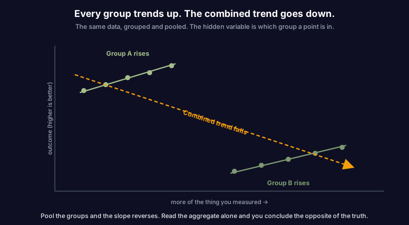
Inside Group A the line rises, and inside Group B the line rises, so within each group more of whatever you measured means a better outcome. But the two groups live in different regions of the chart: Group A has high outcomes at low values, Group B has low outcomes at high values. Draw one line through all the points together and it slopes the other way, down to the right, because the positions of the clouds overwhelm the slopes inside them. The within-group truth and the pooled truth genuinely point in opposite directions, and both are arithmetically correct. Which one is the right answer depends entirely on the question you are actually asking, and that is the part no formula decides for you.
This is what separates Simpson's paradox from an ordinary averaging mistake. There is no single "correct" view you forgot to take. There are two valid views that disagree, and choosing between them is a judgment about which variable is doing the causing and which is just along for the ride. Get that judgment wrong and the paradox does not just confuse you, it hands you a confident, backwards conclusion.
Simpson's paradox in software and knowledge work
The reason this matters beyond statistics class is that modern teams run on pooled metrics. Almost every dashboard number you look at is an aggregate over groups you cannot see in the headline figure, which means almost every dashboard number is a candidate for this reversal. Here are the shapes it takes in practice, the hidden variable behind each one, and how the mistake actually lands.
| The aggregate you see | The hidden grouping | How the reversal bites |
|---|---|---|
| A/B test conversion overall | Traffic source or device mix | The losing variant won in every segment; the test just had an uneven split |
| Overall bug rate dropped | Which team or service shipped | Each team's bug rate rose; a low-bug team simply shipped more of the total |
| Average response time improved | Request type (cheap vs expensive) | Every request type got slower; the cheap-request share just grew |
| Feature adoption went up | New vs returning users | Adoption fell in both cohorts; the user mix shifted toward easy adopters |
| Support satisfaction climbed | Ticket category | Satisfaction dropped per category; easy tickets came to dominate the volume |
| Team velocity rose | Project or work type | Velocity fell on every project; the easy project took a bigger share |
| Churn looks flat year over year | Customer segment | Churn worsened in each segment; the healthy segment grew and masked it |
The pattern in every row is identical: the pooled number moved one way, every meaningful slice moved the other way, and a confounder in the group mix decided which story reached the dashboard. The danger is that the aggregate is not lying in any detectable way. It is the honest answer to a question you did not mean to ask, which is "what happens to the mix of groups I happened to have," rather than "what happens within a group." A team that reads only the top-line metric will act on the mix and believe it is acting on the thing.
This is also why "the data is up and to the right" is never, by itself, an argument. A metric that improves in aggregate can be getting worse everywhere that matters, and the only way to know is to split it. The habit that protects you is cheap: before you celebrate or panic over a pooled number, ask what groups it is pooling over and check whether the trend survives the split.
Simpson's paradox vs Goodhart's law vs the McNamara fallacy
Simpson's paradox keeps company with a family of metric failures, and they get blurred together because they all end in "the number misled us." They are genuinely different, and telling them apart tells you which fix to reach for. Simpson's paradox is the odd one out of the group: nobody has to game anything and nobody has to ignore anything, the arithmetic itself does the misleading.
| Simpson's paradox | Goodhart's law | McNamara fallacy | |
|---|---|---|---|
| What it names | A trend that reverses when groups are pooled | A measure that stops being good once it becomes a target | Measuring only what is easy and ignoring the rest |
| The core failure | Aggregation hides a confounding variable | The measured decouples from the goal | The unmeasured is treated as nonexistent |
| Who is at fault | No one; the pooling does it | People optimizing the proxy | No one; it is a blind spot |
| The fix | Disaggregate and find the lurking variable | Stop tying stakes to the proxy | Name and watch the uncountable factors |
Put plainly: Goodhart's law is about a good metric going bad once people start optimizing it, and Campbell's law sharpens that for high-stakes settings where the pressure corrupts the underlying work. The McNamara fallacy is about never measuring the important thing in the first place. Simpson's paradox is different in kind from all three: the metric was collected honestly, nobody optimized it, nothing was left out, and it still points the wrong way, purely because of how the groups were combined. It belongs to the same broad family as a reward that produces the opposite of what you intended, but its mechanism is arithmetic rather than incentive. When you are diagnosing a number gone wrong, the tell is simple. If the number reverses the moment you split it by some group, you are looking at Simpson's paradox, and the real question becomes which split is the honest one.
How to avoid being fooled by Simpson's paradox
You cannot prevent the paradox from existing in your data, but you can stop it from reaching your decisions. The defense is a small set of habits applied before you trust any aggregate, not a statistical technique applied after the damage. Run the important numbers through these questions.
| Ask this before you trust an aggregate | Healthy answer | Paradox-trap answer |
|---|---|---|
| What groups is this number pooling over? | We know the segments and we have looked at them | It is just the overall figure |
| Does the trend hold inside each major segment? | Yes, we checked the split | We never split it |
| Did the group mix change over the period? | We accounted for the shift | We assumed the mix was stable |
| Is there a confounder correlated with both? | We named it and controlled for it | We did not look for one |
| Which view answers the question we actually have? | We chose it deliberately and wrote down why | We used whatever was on the chart |
The single most useful move is the second one: disaggregate before you conclude. Split the metric by the one or two groupings most likely to matter (source, segment, cohort, request type) and check whether the direction survives. If the aggregate and the splits agree, you can trust the headline. If they disagree, you have found a Simpson's paradox and the aggregate is the wrong number to act on. The AI overview on this topic will happily define the paradox for you; what it will not do is tell you which of your own splits to check, and that judgment is the entire job.
One caution so you do not overcorrect: disaggregating is not always the right answer either. Slice finely enough and every dataset dissolves into noise, and sometimes the pooled number genuinely is the one you want, because the grouping variable is a consequence of the treatment rather than a confounder. The skill is not "always split" or "always pool." It is knowing which variable is causal and which is incidental, which is a question about the world, not about the spreadsheet. This is the same discipline that separates people who reason past the first visible number from people who stop at the chart in front of them.
The context that quietly disappears
Here is where a one-time catch turns into a permanent vulnerability. When your team does spot a Simpson's paradox and decides, correctly, that the segmented view is the honest one, that decision rests on context: which variable was the confounder, why you controlled for it, which split you trusted and which you discarded. That reasoning is exactly the kind of knowledge that decays the moment nobody is actively holding it. Six months later the dashboard still shows the pooled number, the person who understood the confounder has moved teams, and a new analyst reads the headline figure at face value and walks straight back into the reversal you already solved.
The defense is to write the grouping down and keep it next to the metric. When you decide a number should be read segmented, record what it is pooling over, which confounder forced the split, and what the honest view is, in the same durable record as the decision it informs rather than a chat message that scrolls away by Friday. Try Scribelet free and keep the reasoning behind each metric, the splits and the lurking variables and the reason the aggregate was not the answer, somewhere it stays legible to whoever inherits the dashboard. Scribelet's background agents even re-check what you have written against the world over time, so the context behind a number does not quietly rot while the number keeps getting reported as gospel.
Reading Simpson's paradox correctly
The wrong lesson to take from all this is that aggregates are worthless and you should distrust every summary statistic. That is the overcorrection, and it leaves you paralyzed in front of data that is usually fine. Most pooled numbers are honest, and splitting everything into oblivion is its own way of never deciding anything. The accurate lesson is narrower: an aggregate is a claim about a particular grouping, and when the grouping hides a confounder, the claim can invert. The number is not lying. It is answering a different question than the one you have in your head.
So the standing question Simpson's paradox hands you is not "can I trust this chart?" but "what is this number pooling over, and would the trend survive the split?" Ask it before the headline figure drives a decision, keep a written record of the splits that matter, and you turn the paradox from a trap that fools confident teams into a routine check that takes two minutes. Try Scribelet free and let it hold the grouping logic behind your metrics, so the next person to read the dashboard sees the whole story and not just the half the aggregate chose to tell.
Share this article