The Best Obsidian Themes in 2026 (and How to Pick One)
Table of contents
A theme is the most visible thing you can change about Obsidian, which is exactly why it is the easiest way to lose an afternoon. You open Settings, flip on a dark theme with rounded corners and a nicer font, and an hour later you are three menus deep in the Style Settings plugin adjusting the exact shade of your inline code background instead of writing the note you opened the app for.
So the useful question is not "which Obsidian theme looks best." Looks are subjective, and the screenshots in every roundup are cherry-picked. The useful question is "which theme helps me read and write for hours without getting in the way, and which ones are a customization project dressed up as a productivity upgrade." A theme that is calm, readable at your font size, and consistent across desktop and mobile beats a gorgeous one you spend more time tuning than typing into.
This guide covers the themes worth your attention in 2026, grouped by what you are actually trying to do, with an honest note on what each one costs you in setup and upkeep. Start with the all-around picks, then reach for a specialized theme only if you have a specific reason.
What is the best Obsidian theme?
The best Obsidian theme for most people is Minimal by Stephen Ango (kepano), which won Obsidian's official Best Theme award and acts as a clean, content-first canvas you can tune through its companion plugins. If you want to change nothing, the built-in Default theme is genuinely good and the safest choice for long-term stability. Beyond those two, the right theme depends on the job: a focus-first writing theme, a high-density theme for a developer's vault, or a color scheme that is easy on your eyes.
The table below is the quick version; the rest of this guide is the reasoning, including what each theme is bad at.
| Theme | Best for | What it does | Watch out for |
|---|---|---|---|
| Default | Stability | Obsidian's built-in theme, maintained by the core team | Plainer than the community options |
| Minimal | All-around | Content-first canvas, deeply tunable via Style Settings | Needs two plugins to reach its full range |
| Things | Clean light mode | A bright, Apple-inspired look with soft cards | Less customizable than Minimal |
| Soft Paper | Writing and focus | Serif, print-like reading space for long-form | Opinionated typography not everyone likes |
| Shimmering Focus | Distraction-free | Strips the interface down to the text | Hides controls you may want back |
| Blue Topaz | Dense, power-user vaults | High-density layout with fine-grained control | Many settings to work through |
| AnuPpuccin | Color and structure | Catppuccin palettes, rainbow folders, deep tweaks | Depends on Style Settings to shine |
| Catppuccin | Low-eye-strain color | Four soft pastel schemes, light and dark | A palette, not a full layout redesign |
If you already suspect the real issue is not how Obsidian looks but keeping what is in your notes accurate over time, you can try Scribelet free and come back. Otherwise, start by understanding what a theme actually changes.
How Obsidian themes actually work
Before you pick one, it helps to know what a theme is and is not. An Obsidian theme is a bundle of CSS that restyles the whole interface: fonts, colors, spacing, headings, code blocks, and the layout of the sidebars. You install one from Settings > Appearance > Themes > Manage, which opens the community directory, and you can switch between light and dark at any time (Obsidian Help). None of this touches your notes. Your Markdown files are exactly the same before and after, which is the whole point of a plain-text note system: the look is disposable, the content is not.
Three things sit next to themes and are easy to confuse with them:
- CSS snippets are small, single-purpose style tweaks you drop into your vault yourself, without installing a whole theme. Good for one specific change, like hiding a UI element.
- The Style Settings plugin exposes a theme's options as toggles and sliders instead of making you edit CSS. Minimal and AnuPpuccin, among others, are built to be driven by it.
- Theme-specific companion plugins, like Minimal Theme Settings, add controls that only apply to that theme.
That means the most popular "theme," Minimal, is really a theme plus one or two plugins. If you want the full picture of what those plugins do and which are worth keeping, see the guide to the Obsidian plugins worth installing. For now, the takeaway is simple: a theme changes appearance, a plugin changes behavior, and the themes people rave about usually lean on a plugin to get there.
The best all-around themes
If you want one theme that looks good, stays out of the way, and does not demand constant tuning, start here.
Minimal
Minimal is the most popular theme in the Obsidian ecosystem and the default recommendation for good reason. It is a clean, content-first canvas with a true OLED-black dark mode, custom card layouts, image grids, and hundreds of toggleable options through the Minimal Theme Settings and Style Settings plugins (kepano/obsidian-minimal). Its built-in color schemes include Dracula, Everforest, Gruvbox, and others, so you can get a Nord or Dracula look without a separate theme.
Watch out for: the stock install is understated, and most of what people love about Minimal lives behind its companion plugins, so budget a few minutes to turn on the two plugins and pick a color scheme. Once you do, it rarely needs touching again.
Default
The theme you already have is a serious option. Obsidian's built-in Default theme is maintained by the core team, will never be abandoned by a solo developer, and has steadily improved. If you value stability over personality, or you have been burned by a community theme breaking after an app update, Default is the choice that cannot let you down. It is the same logic that makes the core plugins the right starting point before you install anything from the community.
Things
Things is a bright, Apple-inspired light theme with soft cards and generous spacing, popular with people who do most of their work in light mode and want something a little warmer than Default. It is less tunable than Minimal, which is the tradeoff: you get a polished look out of the box and less to configure.
The best Obsidian themes for writing and focus
If your vault is mostly prose and you want the interface to disappear, a focus-first theme matters more than a flashy one.
Soft Paper
Soft Paper is designed for a slow, reflective, print-like writing experience. Unlike most sans-serif themes, it uses classic serif typography reminiscent of a physical publication, with a card-like writing space and colorful folder icons. If you draft long-form notes and want the screen to feel more like paper than an app, it is the standout pick. The tradeoff is that its typography is opinionated; it is a strong aesthetic, not a neutral one.
Shimmering Focus
Shimmering Focus strips the interface down to the text and is consistently among the most-used themes by actual daily usage, not just download counts. Obsidian Forum usage data in 2026 put it at the top of the list of themes people keep running day after day. It is the right choice if controls and chrome pull your eye away from the words. The flip side is that it hides a lot of the interface, so you trade quick access to buttons for a calmer screen.
The honest truth about focus themes is that no amount of visual calm fixes a vault full of notes you no longer trust. A clean reading surface makes stale notes easier to read, not easier to catch. That gap between a tidy interface and reliable content is the one Scribelet is built to close; you can see how the proactive approach works whenever the look of your vault stops being the real problem.
The best Obsidian themes for developers and dense vaults
If you keep a large vault, read a lot of code, or want tight control over headings, tags, and tables, a high-density theme earns its keep.
Blue Topaz
Blue Topaz is a feature-rich, high-density theme beloved by power users who want clear visual hierarchies and fine-tuned control over tags and headers. It packs more onto the screen than Minimal and exposes an enormous range of settings. The cost is complexity: there are a lot of options to work through before it looks the way you want, so it rewards people who enjoy configuration and frustrates people who do not.
AnuPpuccin
AnuPpuccin is a Catppuccin-inspired theme loaded with vibrant color palettes, rainbow folders, and deep layout adjustments through the Style Settings plugin. It is a favorite for developers who want a colorful, structured look with code blocks that read well. Like Minimal, it depends on Style Settings to reach its full range, so plan on spending time in that plugin.
Border and Certino 2
Two more worth knowing: Border is a tidy, structured theme popular with people who like clear edges around panes and blocks, and Certino 2, a winner of the Obsidian Gems award, offers a sleek redesign of the top bar, clean hover animations, rounded code blocks, and window translucency effects. Both are solid picks if Blue Topaz feels like too much and Minimal feels like too little.
The best dark mode and color-scheme themes
Sometimes you do not want a whole new layout, just colors that are easier on your eyes. These are palettes more than redesigns.
Catppuccin
Catppuccin is the official pastel port for Obsidian, offering four soft, low-eye-strain color schemes (Latte, Frappe, Macchiato, and Mocha) in both light and dark. If you already use Catppuccin across your editor and terminal, this keeps your notes visually consistent with the rest of your tools. It is a color system, not a layout overhaul, so pair it with a layout theme or the Default if you want structural changes too.
Nord, Dracula, and friends via Minimal
If you want a specific well-known palette like Nord, Dracula, Everforest, or Gruvbox, you often do not need a dedicated theme at all. Minimal ships several of these as built-in color schemes, so you can get the look inside a theme that is actively maintained rather than installing a single-purpose palette theme that may go stale. This is usually the more durable route than chasing a standalone color theme.
Which Obsidian theme should you pick?
Here is the decision in one pass. Match it to what you actually do most days rather than to the best screenshot.
- You want it to just work and look clean: Minimal, with Style Settings on and a color scheme chosen. If even that feels like effort, stay on Default.
- You mostly write long-form prose: Soft Paper for a print feel, or Shimmering Focus to strip the interface away.
- You keep a big, code-heavy, or data-heavy vault: Blue Topaz or AnuPpuccin for density and control.
- You just want better colors: Catppuccin, or a Minimal color scheme like Nord or Dracula.
- Mobile matters: Minimal is the safest cross-device pick, since many themes are designed desktop-first and treat mobile as an afterthought.
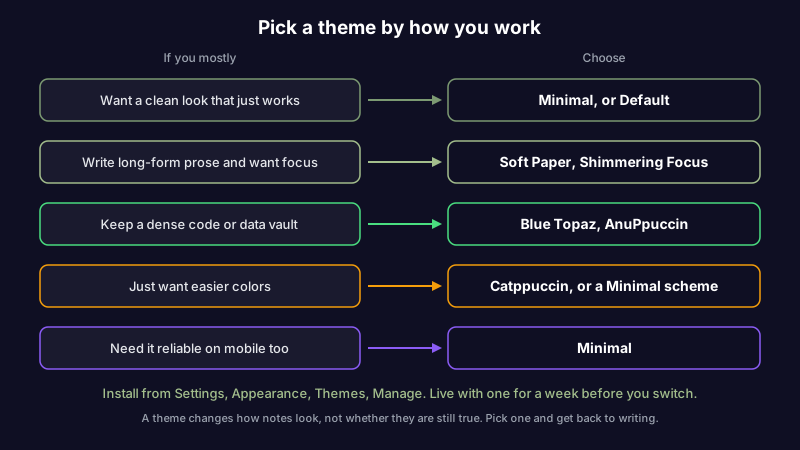
Whatever you choose, install it from Settings > Appearance > Themes > Manage, try it for a week before you commit, and resist switching every time a new theme trends on Reddit. Theme-hopping is its own time sink.
When theming becomes the project
There is a point where customizing Obsidian stops being setup and becomes the hobby. You can tell you have crossed it when you have spent more time this month adjusting your theme than adding notes worth keeping, or when a new theme on the Obsidian subreddit pulls you back into Style Settings for an evening. A beautiful vault is not the same as a useful one, and the two can quietly diverge.
The deeper issue is that a theme is pure surface. It changes how your notes look, not whether they are still true. You can have the most tasteful Catppuccin setup on the internet and a hundred notes that quietly went out of date six months ago, because nothing in any theme, plugin, or color scheme checks whether what you wrote is still accurate. That is the maintenance gap no appearance setting closes, the same one that outlives any Obsidian AI setup, and if you decide the look of your vault was never the real bottleneck, there are maintenance-first alternatives built around keeping notes accurate instead of pretty. Scribelet is one of them: it reads your notes and flags what has gone stale, so the effort goes into trustworthy content rather than a nicer frame around content you no longer trust. You can try it free and keep whichever Obsidian theme you like.
The short version
- Default if you want stability and zero fuss; Minimal if you want the best all-around theme, with Style Settings turned on.
- Soft Paper or Shimmering Focus for writing and focus; Blue Topaz or AnuPpuccin for dense, power-user vaults.
- Catppuccin or a Minimal color scheme when you only want better colors.
- Install from Settings > Appearance > Themes > Manage, live with a theme for a week before switching, and remember that the prettiest vault is not the most reliable one.
Pick a theme that makes the words easy to read, then get back to the notes. The look is disposable; what the notes say is what you will still care about in a year.
Share this article